Thursday, June 19, 2014

Nicala Henderson Presents


My “Telling my own story” is based around a vacation that my family took last year. It is a new, thrilling experience that none of us had ever anticipated being able to go on.


Before I begin though I should mention that my family and I have been on several trips before, including Florida where we went para sailing Niagara Falls, Georgia, Great wolf lodge, and Ottawa Valley where our family owns a cottage that we go to every year.


But we have never been anywhere outside of the United States and Canada. We have always vacationed around those areas so when my mother announced last October that we were going on a cruise, you can only imagine the reaction our family had. We were going on the cruise for my aunts wedding and the entire trip was paid for by my Grandpa who had invited everybody along which only added to the excitement to be going onto the new journey.


It all began with packing for our trip that took a very long time to accomplish since we are a pretty big family and had to pack in all sorts of suitcases and bags into our van. By the time we finished packing the van was filled to the top and we could barely see out of the back window. For our trip we had to go to the Detroit airport and find a parking space for our van. Then we had to take a very small and crowed shuttle to the airport itself and somehow manage to find the rest of our family so that we could leave for the flight on time. Keep in mind, last October was very cold and we had to wear our jackets through the cold and dark streets at very early in the morning.


As it turns out we made great time, and this ended up making us wait extra-long in the airport until the flight was ready to leave. It took longer than the scheduled time to get into the airport itself and then it took another hour before we were finally allowed to board.


As soon as we got onto the plane and were finally ready to take off it turns out that we were driving around the airport in the plane for an hour and not able to take off. Some people suspected something was wrong with the plane and some people thought we had terrorists on board. Well they had nothing to fear it was simply that this “gentleman” had been arguing with the flight attendants and after having refused to turn off his cellphone he had to be escorted off the plane so that we were able to finally leave. 


 I had never been up in the air before and it was most amusing since the clouds looked like snow on mountains where we could walk on without difficulty. It was also interesting because we had passed another plane when flying up in the sky and then we could see the shadow of the plane on the clouds interestingly.


When we landed it was a mad rush to get to a hotel that we stayed at in Florida for a day before we would take a hotel-provided shuttle to get to the boat. And once that day had ended it was line after line to board the ship and actually get going on the cruise itself.


To be completely honest with you my family and I had gotten lost when we were searching for our cabin.


We managed to find it anyways, but it did take quite some time even with the help of the reception desk.


Then it was out to sea and the real fun finally began the following day.


The first leg of our journey was from Fort Lauderdale to Key West. On the Key West islands we had taken a train tour where we were educated in the searing heat on the houses of the area. Interestingly they were built mainly by rich families who instead of moving and having a new house built for them they had completely deconstructed their houses in England and moved them to the key west islands.


Then we were out to sea again for the entire following day we were just on the ship and sailing across open waters where we spotted flying fish jumping out of the water.


Then we arrived in Grand Cayman where the highlight adventure of that day was that we had signed up to go on a submarine tour. The most interesting aspect of this tour was that the further down underwater we got the less color we could see. Eventually everything, in and out of the sub was in black and white but primarily grey. We had seen sea turtles, rare fish and all sorts of coral formations under the water as we traveled. After that we had toured around Grand Cayman some more before heading back to the boat again.


The following morning we had awoken to find ourselves in Ocho Rios Jamaica. 


We had gone to a resort of sorts where we were surrounded by tropical birds but the primary and most exciting part of that day was that we went swimming with Dolphins on the resort.


The following day was all sea again, where we enjoyed a musical that the ship hosted late at night for all the families to come and enjoy. At this point in our journey it was a two day trip until we arrived back in Fort Lauderdale where we had first come from.


Then it was yet another flight home back to the bitter cold of last October’s early winter. It was truly an amazing trip and one I doubt I will ever forget.


This concludes the end of my "Telling My Own Story" ISP Project. Thank You for reading.

Thursday, June 5, 2014

For the Last 30 days of class we have been filming and accumulating short video snippets so that we can create our own unique video's for our Beauty of a Second Project. Here is my video for that project that is around a minute in length.


Friday, May 23, 2014


It's finally ready! Our Splatonic Advertisement can now be viewed here on our google blogger accounts or on YouTube!


Diclaimer: We do not own the music or any products within the video, just the video itself.

Proper Music Credits:

Calvin Harris - Feel So Close ( instr. )

Robyn Miller - Un-finale

Woralks - Flacon De Neige


Thursday, May 22, 2014

Today in Media Arts we were assigned to create business cards for our fake company. In my groups case with Julie Thanaparamy (Whose blog you can view here!) we decided to go with a simple design for our fake company SPLATONIC. Here, I have designed two business cards for each of us with the basic information on it. It has our slogan "Get Ready. Get Splat." our company name SPLATONIC and our logo to the right hand side. It also has a phone number below and the company title and name of employee.

It was a simple to make business card with selecting the correct measurements in photoshop and selecting the Rough Round Bristle and increasing the size from 100 to around 130 or 150. Then I brushed along the edges and moved off the canvas as I was brushing the create the affect I did. My advice would be for more accuracy to use the lasso tool and ruler tools to measure out ideally about how even you want your borders to be.

Wednesday, May 21, 2014


Hello again! For the latest project we were assigned we are expected to create and promote a product. We decided to call ours SPLATONIC which is a line of running shoes and t-shirts designed for young teens and adults who make up the sports demographic. For example, some of the sports our product promotes are displayed by showing a silhouette of a person doing so on the product. In posters they are the focus, or people participating in sports is the focus. Competitive running, basketball, tennis, para-sailing and basically any activity that is "outdoorsy and thrilling" are the focus of SPLATONIC's attention. Paintball being one of the first our product would have been based after. As stated our demographic is mostly focusing on young teens and young adults that's are around at least 15-28 years old. However older athletes are also focused on and just having "a thrilling new experience". For our slogan, we came up with "Get Ready, Get Splat." which gives people excited feeling of anticipation on the upcoming of SPLATONIC. We also defined 2 colours which is red and blue. We chose those colours based on that they indicate taking action of doing something and having trust in yourself to be able to do sports. The RGB values of those colours are: 4e85c5 & bb2c2c. 

Additionally you may view on the left hand side a blue-green macaw- which we will use in our limit edition posters and products as it was painted using a very spray can style brush in photoshop that embodies our products phrase "Get Ready, Get Splat."

Tuesday, April 29, 2014

A couple weeks ago our class had a project to use the provided previously filmed clips and create it into a video that suited what we were trying to present. In other words we had to edit the film. The video that I pieced together can be viewed above, I've named it "The Intruder".

Thursday, April 10, 2014

A personalized Logo that I have made. It features my initials N and H as the main focus, although flipped around and surrounded with 3D style boxes. It was interesting to make but I like the way it came out, as it is possible to use both the top part of the image as well as the bottom or just the bottom as a logo applied onto all of my works.
Logo 1: Starbucks

The first logo here is the starbucks logo that features a twin-tailed mermaid image on a simple circle as the now-famous logo. It is easy to spot out and can be seen in all of their franchises and on advertisements all around.


Logo 2: London Olympics

I also like the London Olympics logo because it is made using only one shape repeated in sync. The meaning behind it is that the rings of fire represent the different countries involved.

Logo 3: Adidas

The adidas logo also shows how simple shapes can make a big impact on your company image. It is made simple but easy to remember and thus can be recognized as Adidas right away.

Logo 4: Tim Hortons

The Tim Hortons logo is nothing more than a circle banner with a gradient applied onto it along with the company's name. It gets the point (that the object is copyright of the company) across and creates a familiar message in the viewers mind. It uses warm colors to attract attention, primarily red. 


Logo 5: Microsoft Windows

The Microsoft Windows simple is also simple and just four different colored squares with a circle that resembles a button on it. I like it though because it is simple but attractive in it's non-crowded shapes and relatively simple colour scheme.

Logo 6: WWF

This logo I like because it is using a type of illusion to create the image of us (the viewers) seeing a panda bear, even when the shape isn't completely filled in. Our brains automatically fill in the missing information even when it is not completely formed. The simplicity of this logo makes it memorable as well as the illusion that they have used.


Logo 7: Skype

Skype logo is again simple. Just an S in white on a blue background that isn't quite a circle.


Logo 8: Apple/Chrome

The apple/chrome logo uses the simple apple logo and makes a slight change in it by adding a streak in the middle to create a "branch off" of the original logo. It, like all the logos displayed here is simple and memorable.


Logo 9: Target

The Logo of target is simple, easy to remember and familiar. It is famous because of that and can be thought as being associated with the store upon sighting.

Logo 10: Firefox

Finally, we have the Firefox logo. It has become a famous icon of firefox search engine, and recognized by the fox circling the globe. It uses high contrast with warm colors surrounding cool colors and that makes it pop and stand out. Thus, it is memorable and attractive to look at. 

Wednesday, April 9, 2014

So, this is my part of a project we had in class that was to create a colour wheel. We were to use only traditional media to create it and had to use magazine pieces from all sorts of different articles to get the different tint and shades you can see here.

I started with the more "easier" to find colours like red and orange. Oh yes, I found lots and lots of orange. We (my group, we all have our individual collages but worked together to collect the pieces) then proceeded to work on collecting greens and blues, topping it off with purples. We tried to make ours appear as if the colours were fading into each other but as you cans see with the purple section of mine that is easier said then done. Especially when you only have a handful of magazines to choose from. Never minding that, I am pleased with my work and here is my colour wheel for you to enjoy.

Friday, April 4, 2014

For how to make portraits of ourselves look like Andy Warhol's works of art.

 First we made a draft/practice piece of the work by selecting and coloring in Marilyn Monroe. This is my practice piece of it.
We then proceeded to make the first part of our Warhol project using our own images.

Afterwords we colored in six different boxes of the Andy Warhol style tutorial by using a color adjustment layer to create different coloring pieces for it. Above you see my final piece of this tutorial assignment. 


Friday, February 28, 2014

John Currin. The Gardeners. 2001
The Gardener - painting- 2001- John Currin [Link to artwork on MoMA]

This painting titled "The Gardener" by John Currin has several examples of principles of design included within it. The one I wish to bring attention to however is the principle of unity. The two people featured in the painting are within close proximity and as such we naturally group them together. However, it is more than it seems. Take the tree to the right of the second person out of the painting and something doesn't feel quite as right with it. Like the balance has been cut off and that there is an wide and uncomfortable gap between the two characters near each other and the tree that balances the image out. By this regard proximity and unity are both high contributing factors to the overall impact of the image. It picture also mainly uses cool colors and has a light, calm and happy feeling. The bright hat and pants of the man though is what draws my attention to the painting first followed by the woman and her dark blue hat. Had the coloring or range of which the characters are portrayed varied from what it is now the image would have a completely different impact.

Shannon Ebner. ETC. 2010

ETC - Chromogenic color print - 2010 - Roe Ethridge [Link to artwork on MoMA]


This photograph titled "ETC" by Roe Ethridge is an example symmetrical balance and emphasis. Without color the big white "&" is emphasized along with it dominating the photograph with it taking up most of the space. The reason I regard this photo as relatively even and symmetrical is that the artist decided to include a stick or pole in the photograph dividing it down the middle. Had these features not have been included the photograph, much like "The Gardener" would have a very different impact on the viewers. For example color  might strain the photo and take away from the attention that the "&" has. So it might be bland and tasteless simply because of it all being bold colors that pop. Considering this I have respect that the photographer decided to take the photo in black and white- or at the very least convert it to such a faze.

Max Weber. Air-Light-Shadow. 1915

Air-Light-Shadow - Polychromed plaster - 1915 - Max Weber [Link to artwork on MoMA]

“to put the abstract into concrete terms” was what inspired Max Weber to create this structure. In terms of principles and design it has both rhythm and unity without variety involved in it. The repetitive side of it would be the triangle shaped figures on the top half of the sculpture. Repetition is also caused from the texture on the structure creating a "common" pattern on the work itself. In this light the structure is differently having element of design included within it- possibly intentionally. 

In conclusion these are the three different pieces from the Museum of Modern Art that I have selected to study and tell about how the different principles of Design are involved within to make them aesthetically pleasing to the human eye.

Wednesday, February 19, 2014


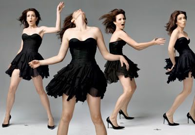
This photographs is just one among million that Annie Leibovitz can proudly claim to have had the  honor of taking. 

This photograph features Tiny Fey, it was taken January 2009 for Vanity Fair magazine. It gives a "party animal" or "wild girl" feeling to it and displays Tina in different poses, and interesting concept for the Leibovitz to experiment with. What I like about it is that it was been placed together flawlessly and managed to get the point that Tina was hoping for across. Which is that she is wild and carefree. I also like how the lighting gives a more happy and upbeat feel to the image as Tina dances about. It is simple, straightforward and yet is complex and managed to capture with outstanding clarity the precision of Tina's movements. Overall these factors have lead me to take a liking to this image I found randomly while searching among Leibovitz celebrity photograph collection.
Just an extra coloring warm-up that I have completed. I liked multiple different styles of the image and have posted them all below. The original lined art for this piece can be found here


Here is the basic Macaw image that I finished. I added all the flat colors to the image, although for the bird wings I had used the gradient tool to make the colors fade into one another. Every surface on the bird had a gradient tool involved, with the tail and wings having a slight gold bordering over it. For the background I didn't use gradient and instead used flat colors, and then continued to go over with the burn and dodge tools respectively. Finally, I added in a grainy filter to the piece so that it looks the way it does now.


I had made another version of it as well, repeating the process above, and instead adding a plastic wrap filter to it.This way you could see the affects I applied to each of the bird layer, making it pop.


 Poster edge style image. It simplified all colors and deleted the more complex areas of the gradient but still managed to make the picture look good. So these, in conclusion were the three different styles I added to the picture after I finished coloring it.

Tuesday, February 18, 2014

So here today we have the class project we our class was working on earlier last week; but apparently couldn't post because of computer complications. I, myself was sick during the days we worked on this assignment so I apologize for any quality loss or very evident mistakes I made. Regardless please enjoy this picture I've titled Giant Food.

It was a very basic Photoshop project that involved taking the provided pictures on the SaundersASM3O website and cutting them out to paste on a single layer. For the curly hair it is suggested that you use the magic wand tool in Photoshop to select and simply go over selecting areas it missed. I, however do not like using the magic wand tool because I find it can be inaccurate and select areas I do not want from the original image. Sometimes it even skips out on areas at all and it annoys me having to rely on that particular Photoshop tool. Instead I used on my home computer the Polygonal Lasso Tool, simply because the magnetic lasso tool does not work well on my computer.(It will often close the selection before I have even reached the end or clicked to add a drop point.) Carefully I selected the entire giant image and went over briefly with the eraser tool after words in order to clean it up a bit. Then I repeated the process with the food image (the boy), which came in great help towards the bottom of the image since his shoes and pants blended in with the rest of the image. Finally I just took both images and stuck them onto the forest file, saved it as GiantFood as both a PDF and GIF image to be save.

Tuesday, February 11, 2014


 Hello again! This is what our class ASM3O has been working on: coloring in Photoshop. This was basically for those not used to Photoshop to get used to coloring with it; but I decided to go off on the web and find a random coloring page for practice for future assignments. Above, is a picture of the coloring page I spent time both coloring and shading and adding a simple blue background.
Basically the way I made it was I applied the flat colors first, and then darkened each layer so that the outline could be visible. Then I went over in another layer and used white to paint all the leaves on the tree. I then turned that layer to soft light so that it appeared as if the shading was lighter green. I also turned the opacity down to 60% so that the green wasn't overpowering the image as much. For the bird himself I also painted in white the shading on him before switching the layer to soft light and reducing the opacity to 56%.


I also decided to include a version of the file when it has no outline included in it- so only the coloring and shading is visible. Personally I like this version of the bird over the one with an outline, because it seems more clean and more impacting to the viewer. However, since the assignment was to color a coloring book page I decided to include both files anyways.