Friday, February 28, 2014

John Currin. The Gardeners. 2001
The Gardener - painting- 2001- John Currin [Link to artwork on MoMA]

This painting titled "The Gardener" by John Currin has several examples of principles of design included within it. The one I wish to bring attention to however is the principle of unity. The two people featured in the painting are within close proximity and as such we naturally group them together. However, it is more than it seems. Take the tree to the right of the second person out of the painting and something doesn't feel quite as right with it. Like the balance has been cut off and that there is an wide and uncomfortable gap between the two characters near each other and the tree that balances the image out. By this regard proximity and unity are both high contributing factors to the overall impact of the image. It picture also mainly uses cool colors and has a light, calm and happy feeling. The bright hat and pants of the man though is what draws my attention to the painting first followed by the woman and her dark blue hat. Had the coloring or range of which the characters are portrayed varied from what it is now the image would have a completely different impact.

Shannon Ebner. ETC. 2010

ETC - Chromogenic color print - 2010 - Roe Ethridge [Link to artwork on MoMA]


This photograph titled "ETC" by Roe Ethridge is an example symmetrical balance and emphasis. Without color the big white "&" is emphasized along with it dominating the photograph with it taking up most of the space. The reason I regard this photo as relatively even and symmetrical is that the artist decided to include a stick or pole in the photograph dividing it down the middle. Had these features not have been included the photograph, much like "The Gardener" would have a very different impact on the viewers. For example color  might strain the photo and take away from the attention that the "&" has. So it might be bland and tasteless simply because of it all being bold colors that pop. Considering this I have respect that the photographer decided to take the photo in black and white- or at the very least convert it to such a faze.

Max Weber. Air-Light-Shadow. 1915

Air-Light-Shadow - Polychromed plaster - 1915 - Max Weber [Link to artwork on MoMA]

“to put the abstract into concrete terms” was what inspired Max Weber to create this structure. In terms of principles and design it has both rhythm and unity without variety involved in it. The repetitive side of it would be the triangle shaped figures on the top half of the sculpture. Repetition is also caused from the texture on the structure creating a "common" pattern on the work itself. In this light the structure is differently having element of design included within it- possibly intentionally. 

In conclusion these are the three different pieces from the Museum of Modern Art that I have selected to study and tell about how the different principles of Design are involved within to make them aesthetically pleasing to the human eye.

Wednesday, February 19, 2014


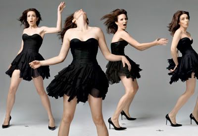
This photographs is just one among million that Annie Leibovitz can proudly claim to have had the  honor of taking. 

This photograph features Tiny Fey, it was taken January 2009 for Vanity Fair magazine. It gives a "party animal" or "wild girl" feeling to it and displays Tina in different poses, and interesting concept for the Leibovitz to experiment with. What I like about it is that it was been placed together flawlessly and managed to get the point that Tina was hoping for across. Which is that she is wild and carefree. I also like how the lighting gives a more happy and upbeat feel to the image as Tina dances about. It is simple, straightforward and yet is complex and managed to capture with outstanding clarity the precision of Tina's movements. Overall these factors have lead me to take a liking to this image I found randomly while searching among Leibovitz celebrity photograph collection.
Just an extra coloring warm-up that I have completed. I liked multiple different styles of the image and have posted them all below. The original lined art for this piece can be found here


Here is the basic Macaw image that I finished. I added all the flat colors to the image, although for the bird wings I had used the gradient tool to make the colors fade into one another. Every surface on the bird had a gradient tool involved, with the tail and wings having a slight gold bordering over it. For the background I didn't use gradient and instead used flat colors, and then continued to go over with the burn and dodge tools respectively. Finally, I added in a grainy filter to the piece so that it looks the way it does now.


I had made another version of it as well, repeating the process above, and instead adding a plastic wrap filter to it.This way you could see the affects I applied to each of the bird layer, making it pop.


 Poster edge style image. It simplified all colors and deleted the more complex areas of the gradient but still managed to make the picture look good. So these, in conclusion were the three different styles I added to the picture after I finished coloring it.

Tuesday, February 18, 2014

So here today we have the class project we our class was working on earlier last week; but apparently couldn't post because of computer complications. I, myself was sick during the days we worked on this assignment so I apologize for any quality loss or very evident mistakes I made. Regardless please enjoy this picture I've titled Giant Food.

It was a very basic Photoshop project that involved taking the provided pictures on the SaundersASM3O website and cutting them out to paste on a single layer. For the curly hair it is suggested that you use the magic wand tool in Photoshop to select and simply go over selecting areas it missed. I, however do not like using the magic wand tool because I find it can be inaccurate and select areas I do not want from the original image. Sometimes it even skips out on areas at all and it annoys me having to rely on that particular Photoshop tool. Instead I used on my home computer the Polygonal Lasso Tool, simply because the magnetic lasso tool does not work well on my computer.(It will often close the selection before I have even reached the end or clicked to add a drop point.) Carefully I selected the entire giant image and went over briefly with the eraser tool after words in order to clean it up a bit. Then I repeated the process with the food image (the boy), which came in great help towards the bottom of the image since his shoes and pants blended in with the rest of the image. Finally I just took both images and stuck them onto the forest file, saved it as GiantFood as both a PDF and GIF image to be save.

Tuesday, February 11, 2014


 Hello again! This is what our class ASM3O has been working on: coloring in Photoshop. This was basically for those not used to Photoshop to get used to coloring with it; but I decided to go off on the web and find a random coloring page for practice for future assignments. Above, is a picture of the coloring page I spent time both coloring and shading and adding a simple blue background.
Basically the way I made it was I applied the flat colors first, and then darkened each layer so that the outline could be visible. Then I went over in another layer and used white to paint all the leaves on the tree. I then turned that layer to soft light so that it appeared as if the shading was lighter green. I also turned the opacity down to 60% so that the green wasn't overpowering the image as much. For the bird himself I also painted in white the shading on him before switching the layer to soft light and reducing the opacity to 56%.


I also decided to include a version of the file when it has no outline included in it- so only the coloring and shading is visible. Personally I like this version of the bird over the one with an outline, because it seems more clean and more impacting to the viewer. However, since the assignment was to color a coloring book page I decided to include both files anyways.

Friday, February 7, 2014

Displaying 20131111_183743.jpg

Here is a picture of my sleeping cat that I took using my cell phone. I thought that this photo showed an interesting style of contrast, with the white sheets that my black cat Luna is sleeping on. I also thought it was interesting because their is bright lighting towards the bottom of the photograph whereas the closer to the top you get the darker shades of grey it is. I felt it was a unique and interesting way to show contrast and lighting effects.


This video strikes me as interesting. I believe that it shows an interesting concept with stunning effects. Displaying what our future will come too, the A Day Made Of Glass video does not use talking but it shows what the company is trying to promote. I believe that it is an interesting strategy for marketing that impacts upon the target market. The music is pretty much the same, but also has an upbeat tune to it which allows us to think positively as we watch our future showcase itself before us. 
Here we have Snake Women. She was made using (as her name suggests) snakes, car tires and wheels, feathers, and different textures. The idea of this assignment was to build a character using things not normal for those body parts (i.e almonds instead of eyes.)
Basically how I made her was I used different textures and a lot and lot of layers. For the wheels, and eyebrows I applied layer effects which made her into how she looks now. For the feathers I used the burn tool, and for the lips I used a mixture of different things.(Layers, burn tool, and pen tool) For the fur texture I ended up using the liquidity tool and Gaussian blur. All this was done in Photoshop and by using pictures I randomly found on the internet. 

Thursday, February 6, 2014

Hello, my name is Nicala Henderson. What interests me in multimedia art is that it is such a wide range of works. It can be anything from drafts to portraits to interactive posters on the web! With such variety what's not to like? It's also a growing art industry that has many opportunities provided one knows what they are doing. I honestly don't know what to expect this semester but I am looking forward to working with photoshop and illustrator programs. The idea of keeping all our notes on a blog is also new and interesting to me.

This is my teacher Mr. Brouwer's website

Gone Fishin - By Canadian Artist Denyse Klette

This piece of work made by Denyse Klette (titled Gone Fishin) interests me because I find it visually appealing. It visually appears as if the characters are literally "popping out" of the canvas. It is also- although chaotic rather balanced out well, with characters or objects filling every part of the page. It is also rather detailed with fish, bubbles and the sand at the bottom of the canvas being only a few of the interesting and colorful aspects of the work itself.
In 2009, Brazilian artist Nele Azevedo carved these incredible tiny ice sculptures of men on the steps of Gendermenmarkt Square in Berlin. Aside from being beautiful, Azeveedo created the thousand miniature people to shed light on the effects of global warming and the World Wildlife Fund’s warning that melting ice could cause water levels to rise. Needless to say, the tiny men didn’t stay sitting for long
Read more at http://all-that-is-interesting.com/most-interesting-installation-art#BGdEFhpuxKLdpYdm.99

Monday, February 3, 2014

This is one of my favourite commercials by Kmart. My other favourite is the "I Ship my pants" one.